There are a variety of elements that can be used on a recommendation form in PWS. Each element functions differently. Your choice of elements, and their attributes, will help you control the length and readability of a form and the recommender’s experience.
Before you build an online Teacher Recommendation form in PWS, consider the data you wish to collect. Determine which element type will best suit each step of your form, and plan the order of elements.
Submitted recommendation forms will be uploaded into PORTAL as pdfs.
Element Attributes
Elements can have:
- Labels – This text appears on the left of the element; exception: single Checkbox, where the label appear on the right.
- Values – These are the options presented on the right of an element on a form.
- Attributes – These define the formatting of the element as it displays on the form. When you create an element, attributes may pre-populate as default settings in the Edit Element window.
- Hints – These display an example of how an answer might be formatted (as for the desired format of a phone number).
LAYOUT TIP: The Label appears to the left of your element. If you want a label to have a carriage return in a specific location, so as to create a particular line break, create your element first and then add the label after you have created the element.
Elements in which a Recommender can enter data
TEXT BOX
A Text Box is an editable, single line, text entry box. Use it when you expect a short answer. There is no practical character limit for a Text Box, but if you seek a longer answer, use a Text Area instead.
TEXT AREA
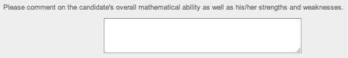
A Text Area is a multi-line text entry box. Recommenders can enter longer responses here. There is no practical character limit.
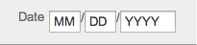
DATE PANEL
A Date Panel is a single line with three separate boxes (DD/MM/YYYY) for collecting a date. The recommender fills in the date information.
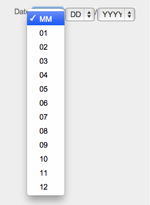
DATE DROP DOWN
A Date Drop Down helps you to sanitize data input, as applicants choose from drop down menus instead of entering their own data.
The Date Drop Down appears on a form, as three separate menus:
- MM displays numbers 1–12 (months of the year)
- DD is numbers 1–31 (dates in a month)
- Attributes control what is displayed in the YYYY menu
Enter this screen by clicking on the green arrow in the element row:
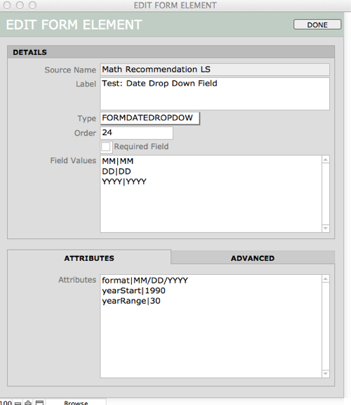
NOTE: The character used to separate details in Attributes is called a Substitution pipe. See your keyboard, the Substitution pipe is located on the same key as the “\”.
CHECKBOX GROUP
A Checkbox group gives you one or more checkboxes grouped together under one header. Multiple boxes can be selected.
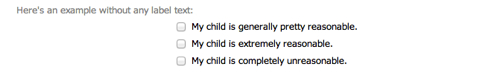
Your checkboxes can be arranged in columns or rows, using the Attributes within Edit Element (open this window by clicking the green arrow).
NOTE: To display a list of values, each value must be separated by a carriage return in the Field Values portion of the Edit Element window.
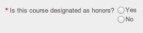
RADIO GROUP
A Radio Group offers multiple choices, with only one answer possible. It offers one or more radio buttons grouped together under one label. Only one value can be selected.
Format the values of a Radio Group as you would a Checkbox Group (above).
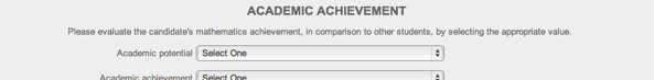
DROP DOWN
A Drop Down element displays a drop-down list of values where you expect the end-user to choose one value from a long list. A Drop Down element is an alternative to a RADIO GROUP, since it returns only a single value—but it takes much less space, especially if the list of values is long.
NOTE: When creating a value list for a Drop Down menu, always begin your list with a blank line at the top (or an instructions such as “Select One”). If you do not have a blank line at the top of the list—and some value appears at the top—you can never be certain that the end user chose the value. It is possible that they skipped the question and the top value is returned by default.
Elements that are display only
TEXT
A Text element displays an un-editable block of text. If you are sending up a calculated field from your solution, or another field that you do not want the end user to change, this is probably how you want to display it.
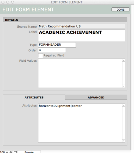
HEADER
Add a Header when you want to insert headline-formatted text that guides an end user through the content of your form.
In this example, the Header is centered, as you can see in the element Attributes:
PARAGRAPH
A Paragraph is text, formatted left aligned. If you will be entering several paragraphs, you may want to make each separate paragraph a Paragraph element of its own. This could make it easier to locate a particular paragraph on a long form if you want to edit it later on.