In SchoolForms Online, there are a variety of elements that can be used on a form. Each element functions differently.
Before you build an online form, consider the data you wish to collect, the fields that will pre-populate your form and the fields to which you will upload collected data. Determine which element type will best suit each step of your form, and plan the order of elements.
A Form of type PAYMENT will give you access to Form Elements that pertain to calculating totals and resulting in a payment by credit card transaction. PAYMENT elements are not visible for types FORM or MEMO.
Form elements will be highlighted in pink if they are not valid for the particular form Type you have selected.
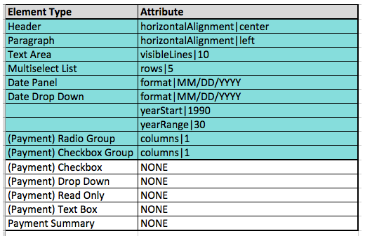
Element Attributes
Elements can have:
- Labels – This text appears on the left of the element; exception: single Checkbox, where the label appear on the right.
- Values – These are the options presented on the right of an element on a form.
- Attributes – These define the formatting of the element as it displays on the form. When you create an element, attributes may pre-populate as default settings in the Edit Element window.
-
Hints – These display an example of how an answer might be formatted (as for the desired format of a phone number).
Editing Elements
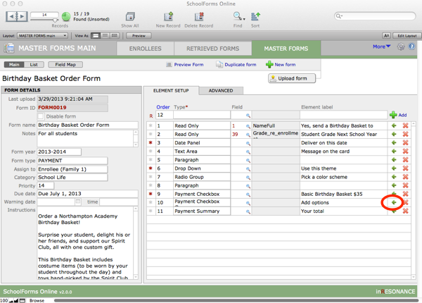
Edit any element on your form by clicking the green arrow at the right end of the element row:
This leads to the Edit Element window, where you can enter Values and Attributes.
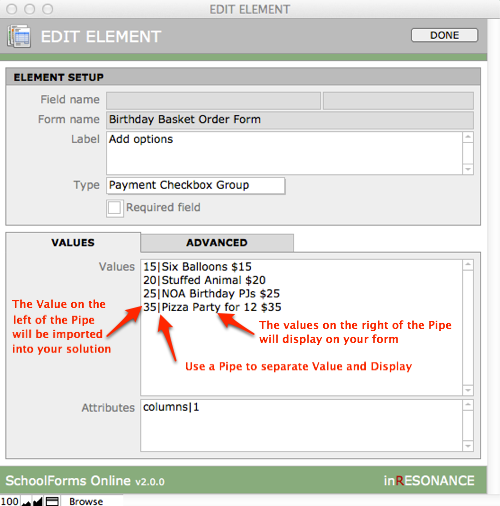
NOTE: Use a Substitution pipe (typed as shift+backslash) to separate the value that will pass into your solution (on the left) from the value that will display on your form.
Elements whose contents are editable by the family on the web
TEXT BOX
A Text Box is an editable, single line, text entry box. It may display data from your solution. You are expecting the family to enter new data or review/edit the pre-populated data from the core solution.

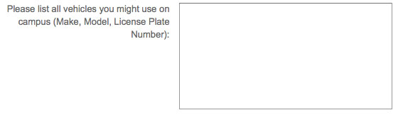
TEXT AREA
A Text Area is a multi-line text entry box. Families can enter longer responses here. There is no practical character limit. A Text Area can be pre-populated with editable data (e.g. medical data from the previous year).
Use Attributes to specify the size of the frame (a certain number of characters wide, or a certain number of lines tall), such as:
- characterWidth|40 – This text area will be 40 characters wide.
- visibleLines|10 – This text area will be 10 lines tall, with a scroll bar active if there are more lines.
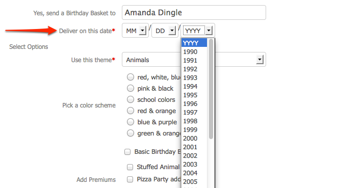
DATE DROP DOWN
A Date Drop Down is a cluster of three drop-down menus, for Month, Day, Year.
Use Value to specify the text for ghost labeling in the three fields (MM, DD, YYYY) (that is, the label appears inside the field container).
The Attributes determine:
- the order of the date fields (MM/DD/YYYY or DD/MM/YYY)
- whether the fields are separated by slashes or hyphens
- which years display as choices
by entering the following:
- format|MM/DD/YYYY – Use slashes to separate your date fields.
- format|MM-DD-YYYY – Use hyphens to separate your date fields.
- yearRange|30 – Thirty years will display in the YYYY drop down.
- yearStart|1990 – The thirty year list will begin with the year 1990.
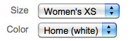
For example, use these Values and Attributes:
To result in this element display on your form:
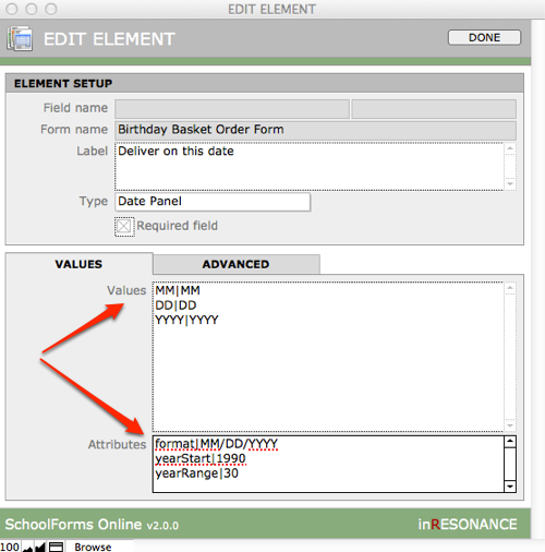
DATE PANEL
A Date Panel is a cluster of three fields (MM / DD / YYYY) in which Month, Day, Year is manually entered.

Use Values to specify the text for ghost labeling in the three fields (MM, DD, YYYY) (that is, the label appears inside the field container).
Use Attributes to specify the order of fields, the separator (“/” or “-“), and the list of years (Drop Down only), such as:
- format|MM/DD/YYYY – Use slashes to separate your date fields.
- format|MM-DD-YYYY – Use hyphens to separate your date fields.
Elements offering the family a choice
CHECKBOX
A single Checkbox offers the opportunity to respond Yes (I want this).
If you seek a single YES value (such as to indicate “I intend to apply for Financial Aid”), this box collects the boolean value of “1” if selected or “null” if not selected. This checkbox can check the corresponding checkbox in your core solution if it is mapped to do so.
- Use the Label (which appears to the right of a Checkbox) to enter your text;
- Enter “1” as the Field Value.

NOTE: A checkbox will not display any text label to the left. If you desire a label on the left, use a Checkbox Group with only a single checkbox.
CHECKBOX GROUP
A Checkbox Group gives you multiple checkboxes grouped together under one label. Multiple boxes can be selected.
If you display a multiple choice list in which multiple boxes may be selected, the data that will be returned to the mapped field in your solution will be the data that appear to the right of the checkbox on the form. If you want to display long descriptive values on the form, but pass shorter text into your solution, use the Substitution pipe as you define Values.
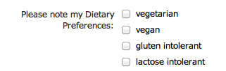
To display a list of values, each Value must be separated by a carriage return.
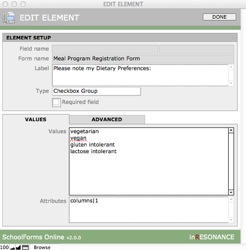
Use Attributes to specify the number of columns or rows:
- columns|1 – Checkboxes or radio buttons will appear vertically, in one column
- rows|1 – Checkboxes or radio buttons will appear horizontally, in one row (keep labels short)
RADIO GROUP
A Radio Group offers multiple choices, with only one answer possible. It offers one or more radio buttons grouped together under one label. Only a single value is returned. The data that will be imported into your solution is the value that appears to the right of the selected radio button. A radio group allows you to use descriptive text for a list of 2-6 options.
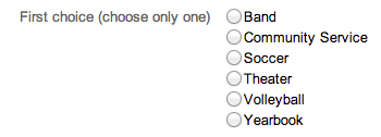
Values and Attributes of a Radio Group are identical to a Checkbox Group (above).
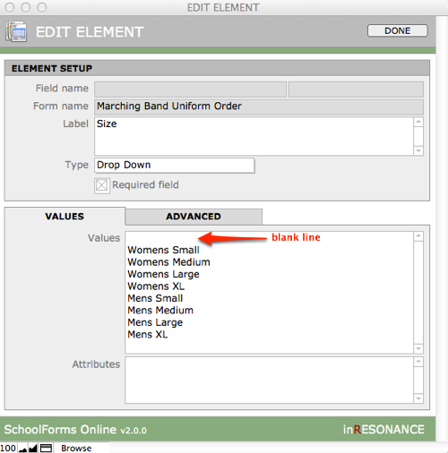
DROP DOWN
A Drop Down element displays a drop-down list of values where you expect the end-user to choose one value from a long list, and are typically used when there are multiple related choices to be made at the same time. A Drop Down element is an alternative to a Radio Group, since it returns only a single value.
NOTE: When creating a Value list for a Drop Down menu, always begin your list with either a blank line at the top, or enter “\-Please Choose-” as the top line. If you do not have a blank line or Please Choose at the top of the list—and one of your values appears at the top—you can never be certain that the end user chose the value. It is possible that they skipped the question and the top value is returned by default.
MULTISELECT LIST
In a Multiselect List, your list of choices will appear in a box with each item on a separate line. Use Attribute to set the number of lines that will display by default. If there are more choices/Values than the number of lines, your box will have a scroll bar. Multiple lines can be selected by clicking Command+ the next item.
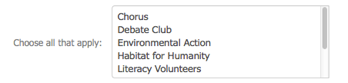
In Values, use a Substitution pipe to separate value|display.
Use Attributes to specify size of the frame, such as:
- characterWidth|40 – This text area will be 40 characters wide.
- visibleLines|10 – This text area will be 10 lines tall, with a scroll bar active if there are more lines.
Elements that are display only (not editable)
HEADER
A Header is designed to introduce a new section of your form. It is un-editable text that by default is aligned at the far left of the form.
Use Attributes to specify horizontal alignment (left, center, right), such as:
- horizontalAlignment|center – This paragraph will be centered in the form.
- horizontalAlignment|left – This paragraph will be aligned left.
PARAGRAPH
A Paragraph element displays an un-editable block of text that spans the width of the page.
Use Attributes to specify horizontal alignment (left, center, right), such as:
- horizontalAlignment|center – This header will be centered in the form.
- horizontalAlignment|left – This header will be aligned left.
READ ONLY
A Read Only field has a label on the left and displays content from your solution in the field area on the right. If you are sending up a calculated field from your solution, or another field that you do not want the end user to change, this is probably how you want to display it.
Payment Elements
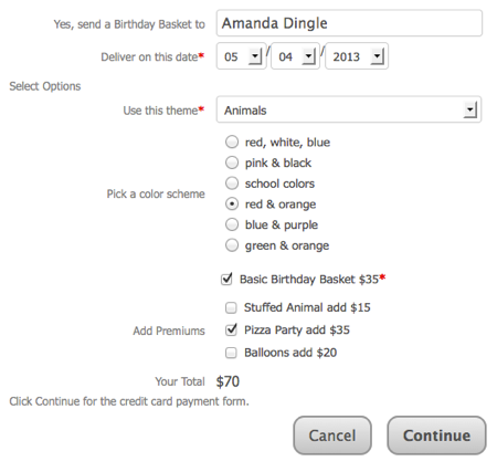
Payment elements record transaction amounts. They are automatically totalled as the form is filled out. You must include a Payment Summary element on your form: this running total determines the transaction amount that will be passed to the credit card payment page.
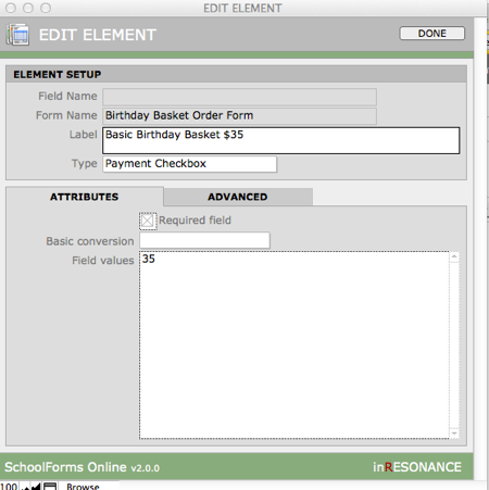
PAYMENT CHECKBOX
Use the Label to describe the item and also show its cost. Enter a currency amount as the Value.
PAYMENT CHECKBOX GROUP
In the Edit Element window, enter the currency value to the left of a Substitution pipe and the text display to the right of the Substitution pipe. When a parent checks one or more of the checkboxes, the running total will be calculated and displayed in the Payment Summary field.
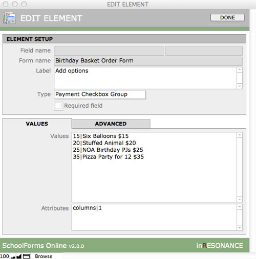
In the example below, in addition to entering the currency value to the left of a pipe, you can add a semicolon and a second value that can both be pushed to your solution. This gives you additional data, which can be especially useful if things are the same price.
PAYMENT DROP DOWN
Values can be displayed in a drop-down menu format. One value can be selected in a drop-down menu.
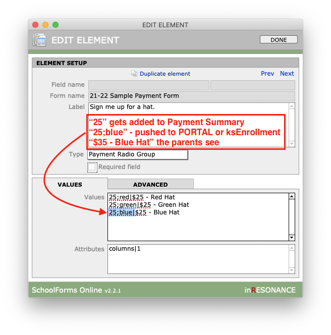
PAYMENT RADIO GROUP
This is used for a short list of possible purchasing choices. Only one value can be selected.
PAYMENT READ ONLY
This field can display a value that is pre-populated from your core solution.
PAYMENT SUMMARY
This field is required to show the running total of all the options selected on a payment form. This calculated value will be the amount charged on the credit card transaction for the form.
PAYMENT TEXTBOX
A parent can enter an amount they wish to pay or contribute when you provide a Payment Textbox.
Advanced Attributes
Within the Edit Element area, the Advanced Tab is where you can:
- Enter conversions associated with field mapping
- Overwrite destination with empty data
- Insert a Hint next to an element on the form
Add a Conversion to element data
If the data a parent enters on a form needs to be converted into a different format when it is brought into your core solution—they enter “Yes” to a question that then should mark a checkbox in the solution, or a timestamp on a form needs to display as a date in the solution—you can manage that on the Advanced tab. This is an advanced task, and we recommend that you contact [email protected] for a bit of training first.
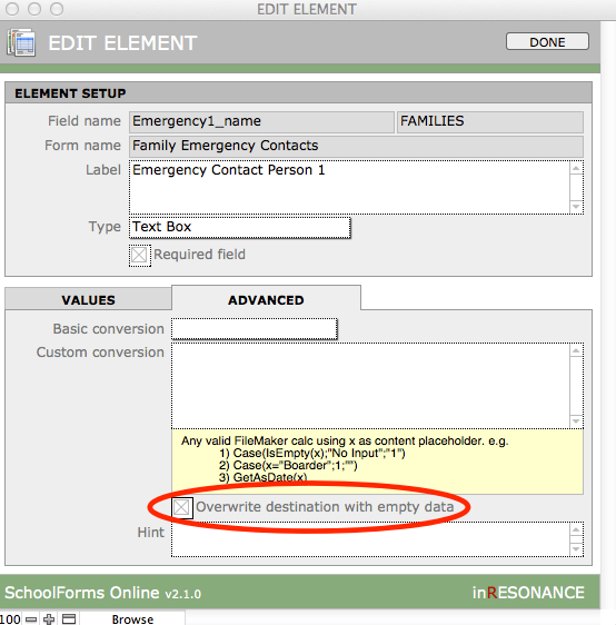
Overwrite destination with empty data
In most cases, if a parent leaves a field on an online form blank, you do not want that blank to overwrite data you may have in your solution. However, in cases such as an Emergency Contact form, a parent might delete an emergency contact you have uploaded from your current data—and they might not enter any new contact in its place. You can edit this element to overwrite the destination field with no data on the advanced tab.
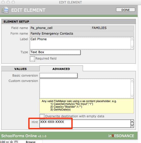
Add a Hint
You may want to display a helpful hint next to a field, such as how to format a telephone number. You may add a Hint on the Advanced tab.